Product Design
Introduction
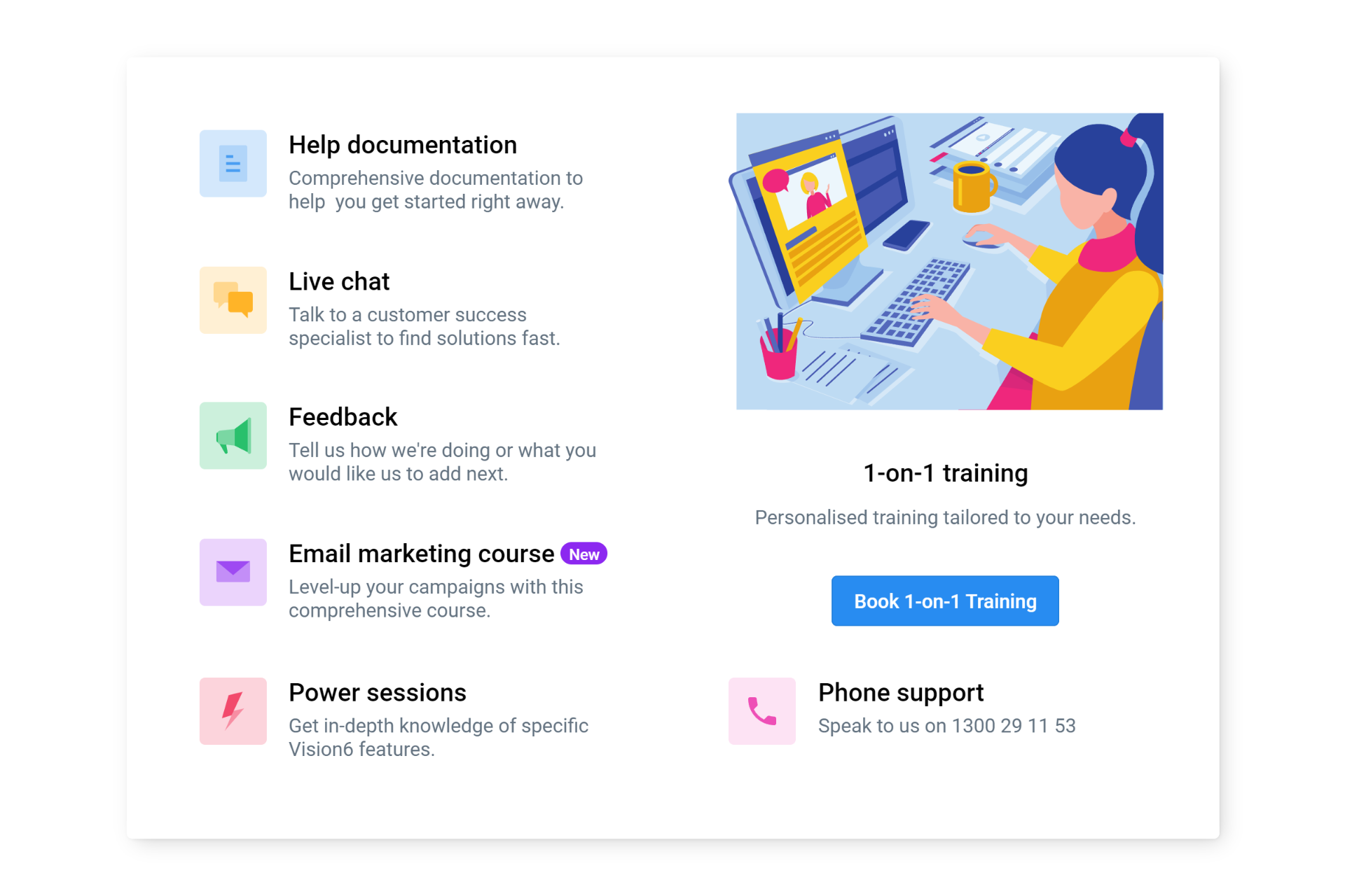
When Vision6 introduced a range of new customer support services—from customised training and power-user sessions to regular webinars on various email marketing topics—the limitations of our existing help menu became clear. While this standard drop-down menu had been serviceable and wasn’t causing any user issues, it had been showing its age for some time. As a result, it remained a low-priority item in terms of resource allocation.
Recognising the necessity to effectively showcase our range of new support services, I made a professional recommendation based on UX best practices to transition from the existing drop-down help menu to a more versatile Mega Menu. The former was clearly limited in its expressive capabilities, lacking the features needed to highlight the richness and sophistication of the services on offer. A Mega Menu would provide a vastly improved user experience while minimally impacting the existing user interface—saving us the need to allocate additional resources for educating users about UI changes.

The Advantages of Mega Menus
Building on the necessity to enhance our Help menu, the adoption of a Mega Menu serves as an effective solution that elevates user experience in multiple ways. Below, I highlight some of the benefits that make Mega Menus superior to traditional drop-down menus and which lead me to recommend this design pattern to promote the new support services:
Rich Content Presentation
The ability of mega menus to host rich media such as images, icons, and short descriptions, provides more context for users. This eliminates the guesswork from the navigation process, making it easier for users to make informed choices.
Better Content Grouping
Mega menus allow for the logical grouping of related options, offering a level of semantic clarity that enhances the overall navigability of the platform.
Reduced Clicks and Navigation Time
Unlike standard drop-down menus that are limited to a single dimension of layout, mega menus make use of two dimensions to display options. This extra layer of organization significantly reduces the number of clicks needed for users to reach their intended destination. By offering a well-structured, at-a-glance overview of the content hierarchy, users can more efficiently identify where they want to go, making the navigation process both quicker and more intuitive.
Increased Accessibility
A well-designed mega menu, with its two-dimensional layout, accommodates a large volume of content without compromising on accessibility. This makes it user-friendly for people with different browsing habits and screen sizes.
Conclusion
The transition from a standard drop-down menu to a Mega Menu wasn’t just a matter of chasing a trend in UI/UX design. It was a calculated move aimed at significantly improving the way we present our evolving range of customer support services. By adopting a Mega Menu, we’ve been able to enhance content presentation, improve logical grouping, reduce clicks and navigation time, and increase accessibility—without a drastic change to the existing user interface. This seamless integration with minimal disruption speaks to the power and utility of Mega Menus as an effective tool in modern interface design.